Wise and Miller

BRAND IDENTITY FOR WISE AND MILLER

Wise & Miller is a recruitment agency Based in Dubai.
They are specialised in executive search, assessment and executive Coaching. Since 2008 they are assisting companies in the Middle East selecting and retaining senior talent.

I designed their brand identity which they still use today. www.wiseandmiller.com

* Logo for Wise&Miller

* Letterhead and business card.

* Various roll-up banners for office and event use.

IJland

BRAND IDENTITY FOR IJLAND

IJland tax and administration is a small bookkeeping company based in Amsterdam, the Netherlands. I was asked to design their brand identity when I asked them to do my administration. To do my own bookkeeping was always an annoying and tedious task.

I let IJland do this job for me so I didn’t have to be annoyed anymore. This became the concept for the Ijland logo: “Mens erger je niet” in Dutch or “Don’t be annoyed” aka Ludo. I designed this brand identity many years ago. Today IJland has a different look.

* Logo/typeface drawn by hand. Loosly based on Ludo (aka “Mens erger je niet”).

* Letterhead and invoice.

* Various envelopes and business card.

* All clients received this birthday card on their birthday.

Fort Resort Beemster

BRAND IDENTITY FOR FORT RESORT BEEMSTER

Located 29 km from Amsterdam, set in a luxuriously renovated fortress, Fort Resort Beemster, features a hotel, a modern spa and a restaurant. All facilities are eco-friendly and they serve organic food and drinks.
I was asked to design their brand identity when they first opened in 2012 together with the design and build of their website.

Fort Resort Beemster logo
Fort Resort Beemster - stationary

* Logo and stationary design for Fort Resort Beemster.

Fort Resort Beemster - giftcard and with compliment card

* Designs for a giftcard and a with compliments card.

Fort Resort Beemster - website - initial design

* Website designs and build when Fort Resort Beemster opened in 2012. 

Fort Resort Beemster - Bathrobe and slipper design

* Designs for a bathrobe and slippers. To be worn in the wellness centre of Fort Resort Beemster.

Fort Resort Beemster entrance
back to portfolio

WTS Energy

BRAND IDENTITY FOR WTS ENERGY

WTS Energy is the leading Consultant/Manpower Supply Company for the international Oil, Gas and Energy industry. They operate globally with offices in 20 countries.

When the company started more than a decade ago I was asked to design their corporate identity. On this page you find a selection of the designs I made for them over the years.

WTS Energy - logo
WTS Energy - stationary

* Stationary designs including a letterhead, business card, with compliment card and even a X-mas card.
Occasionally the WTS Energy logo needs to be adapted for local purposes.

WTS Energy - roll-up banners

* Several roll-up banners for various events.

WTS Energy - brochure front page
WTS Energy - brochure page 2-3
WTS Energy - brochure page 4-5
WTS Energy - brochure page 6-7
WTS Energy - brochure page 8-9
WTS Energy - brochure page 10-11
WTS Energy - brochure last page

* Designs for the WTS Energy company brochure. The brochure is available in print or digital. .

WTS Energy - website

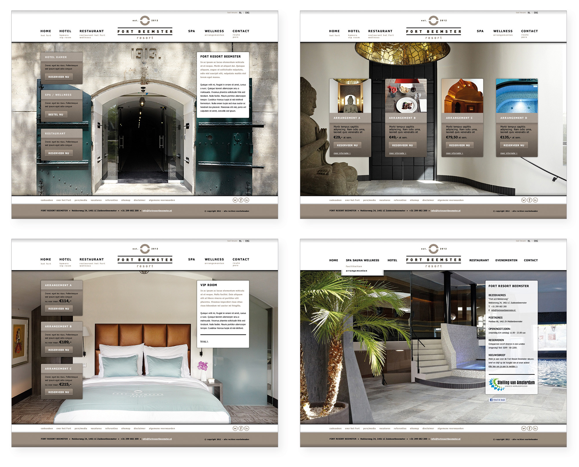
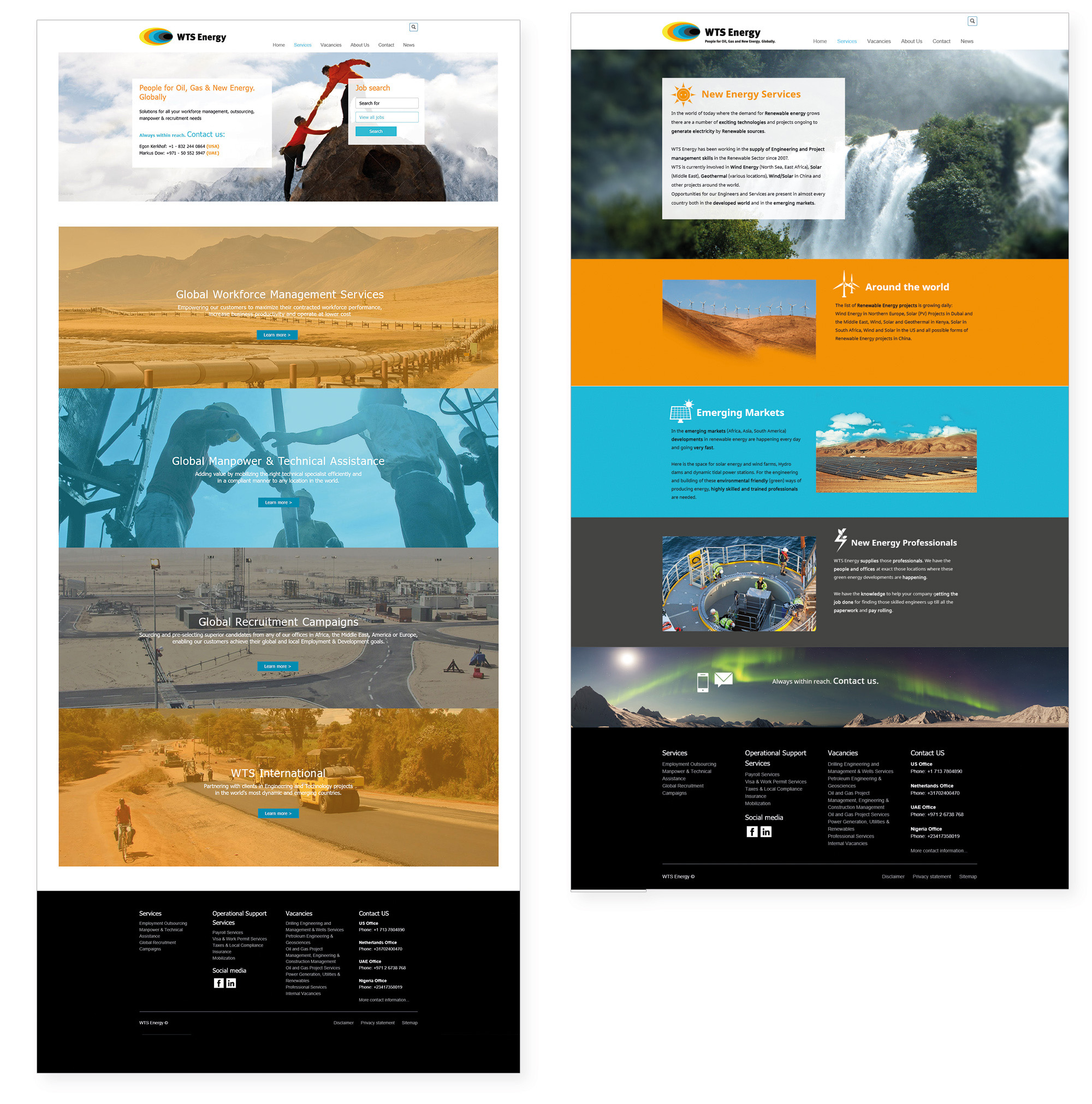
* Designs for the website of WTS Energy: www.wtsenergy.com.

* A few years ago WTS Energy sponsored a boat in a sailing competition in and around the waters of Dubai.
I designed the hull, sails and crew clothing.

back to portfolio

RO-infra BV

BRAND IDENTITY FOR RO-INFRA BV

RO-infra BV is a contracting company who builds roads, sewer systems, parks and renovates them as well.


When the company was founded more than a decade ago, I was asked to design their brand identity.
Over the years I’ve designed almost everything from their business cards to their website,
even the livery for their mini shovel.

More about their work on www.ro-infra.nl

RO-infra BV is a contracting company who builds roads, sewer systems, parks and renovates them as well.
When the company was founded more than a decade ago, I was asked to design their brand identity. Over the years I’ve designed almost everything from their business cards to their website, even the pattern for their mini shovel.

More about their work on www.ro-infra.nl

RO-infra stationary

* RO-infra BV stationary: letterhead, business card (front and back) and EA5 envelops.

* More stationary: note books and pads to administer the amount of materials and equipment used for each project. And of course, a multi-touch pen to write everything down. The other end of the pen can be used for tables and smartphones. The forms recently have been upgraded to digital versions.

RO-infra calender

* Since 2015 a calendar is made and distributed to employees, suppliers, old and new clients every new year.

RO-infra website

* Multi page company website: ro-infra.nl

RO-infra equipment

* RO-infra BV equipment: spray painted or printed in the company colours.

back to portfolio
Go to Top